By: Anthony Zangrillo
Edited by: Kristin Ho
In their inaugural event, Tribeca Games partnered with League of Legends maker Riot Games to present The Craft and Creative of League of Legends, a series of panels on the design that goes into make the world’s most popular eSport. The series began with a breathtaking opening performance of Diana’s theme, arguably one of the most beautiful login themes of the game to date, follow by introductions by Tribeca Enterprises CEO, Jane Rosenthal, and Riot Games Game Design Director, Greg Street.
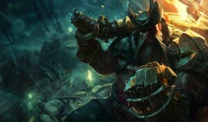
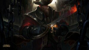
The first panel brought insight onto a very memorable champion update: Gangplank, the Saltwater Scourge. Very much in line with the conclusion of the panelists, Gangplank existed in the game primarily as a meme for his orange-eating skill and a pirate trope. I had only played him once before his update in late July through August and I neither wanted to buy him nor play him again. His update was told as a story over the course of several days, which included a temporary visual update for my favourite game mode map, ARAM (All Random All Mid). These visual updates were also packaged with new audio for game announcements in the voice of the updating Gangplank. Initially, Gangplank himself received some visual updates which made him seem more threatening but composed than he had before. In fact, in the splash art for the Captain Gangplank skin originally posed as the “updated Gangplank splash,” he initially looks as though he is peeling an orange with his sword. Upon closer inspection, we realized Gangplank is actually glaring right at the viewer. The champion update team at Riot Games successfully managed to keep a playful but still menacing aura for the pre-death Gangplank. Following his death and temporarily disablement in the game, we received the final base Gangplank splash art. You can see that there is nothing light or playful about the new Gangplank, precisely what the team had wanted to convey. Playing the game, I glazed over a number of these differences. The primary change I noticed and appreciated was Gangplank’s departure from the red-coat adorned pirate trope. Thus, it was exhilarating and eye-opening to witness the thought process that went behind each part of his update, down to the decision to disable him – which was a first experience for me, as champions historically had only been disabled due to critical bugs.
The Art Demonstration panel was intriguing to me as a player, an artist, and a hopeful future game designer. In the game, it is easy to criticize the look of the models, who often times may have freakishly skinny limbs or have hair that stick out unnaturally in the air. Having watched a live sculpting of Sion, the Undead Juggernaut, the level of detail and the ease Sion was made before our very eyes gave me a new appreciation for the models we see in game. It is not that the artists do not have the skill or Riot does not prioritize the quality of the models, but that certain features are exaggerated so that they are easily visible for models that are the size of a quarter.

Champion splash arts are one of my favourite parts of League of Legends. More often than not, I will try or buy a champion based on their splash art. When the Kindred champion splash art came out, my immediate focus was Kindred, although they were primarily in the shadow of the splash art. This was intentionally and skillfully done, down to the decision to brighten their eyes, painting the grass blades towards Kindred, and the blue arrow pointing upwards towards Kindred. Adding the other proposed sketches for Kindred’s and Dino Gnar’s splash arts to the panel also offered insight into the decision making that goes through every splash art, which I feel often goes underappreciated by players. Prior to attending this panel, I had not even noticed the smashed wall behind Dino Gnar, or his purposefully large shadow, both which incorporate the pillar of Mega Gnar, a central mechanic to playstyle of Gnar. I look forward to examining future splash arts, particularly of new skin splashes, that craftily instill the core pillars that make a champion into the art.
The final feature of the Art Demonstration was the decision process behind visual effects for champions. This session was a particular favourite of mine, as I only buy champion skins if they have visual effects upgrades, such as Arclight Vayne and Slayer Jinx. When skins get visual effect upgrades, they have historically always been particularly cute or thoughtful. For example, the Popstar skin for the champion Ahri had a visual upgrade that left a trail of musical notes to match the theme of her skin. Original skins also have thoughtful visual effects; the champion Ryze, a master of arcane runic magic, has a skill that leaves a faint trail of rune symbols. In addition, VFX Artist Shannon Berke explained the colour choices behind Ryze; while I had known that Ryze and Xerath both practice runic magic, I had always thought that Ryze and Xerath had blue colour schemes to match the colour scheme of the champions themselves. In truth, Berke pulled similar colours from Xerath’s palette into Ryze’s palette intentionally, bringing cohesion in the magic these two champions share. Yet, the visual effects for the champions are not exactly the same. Looking at the visual effects alone, Ryze’s spells are easily identified as reserved, with a looming threat of power that reflects Ryze’s arcane magic.
As interesting as these two first panels were, I would have enjoyed discussion of other champion designs, particularly the series of overpowered upgrades to two particular groups of champions, juggernauts and marksmen. These recent upgrades have thrown the game in slight chaos, so it would be interesting to see the decision making behind these changes. As an avid player of League of Legends, I look forward to the continued partnership between Riot Games and Tribeca Games.


0 Comments